
Interpret the results
Analyze results
Once your project is complete, you can explore and analyze the results of the tested sites.
The results are available both on the map and in a summary table. The map gives you a visual overview of the relative impact of each site, while the table provides the detailed indicators calculated by the platform model. Together, these views help you identify the most and least promising sites and support your final decision.
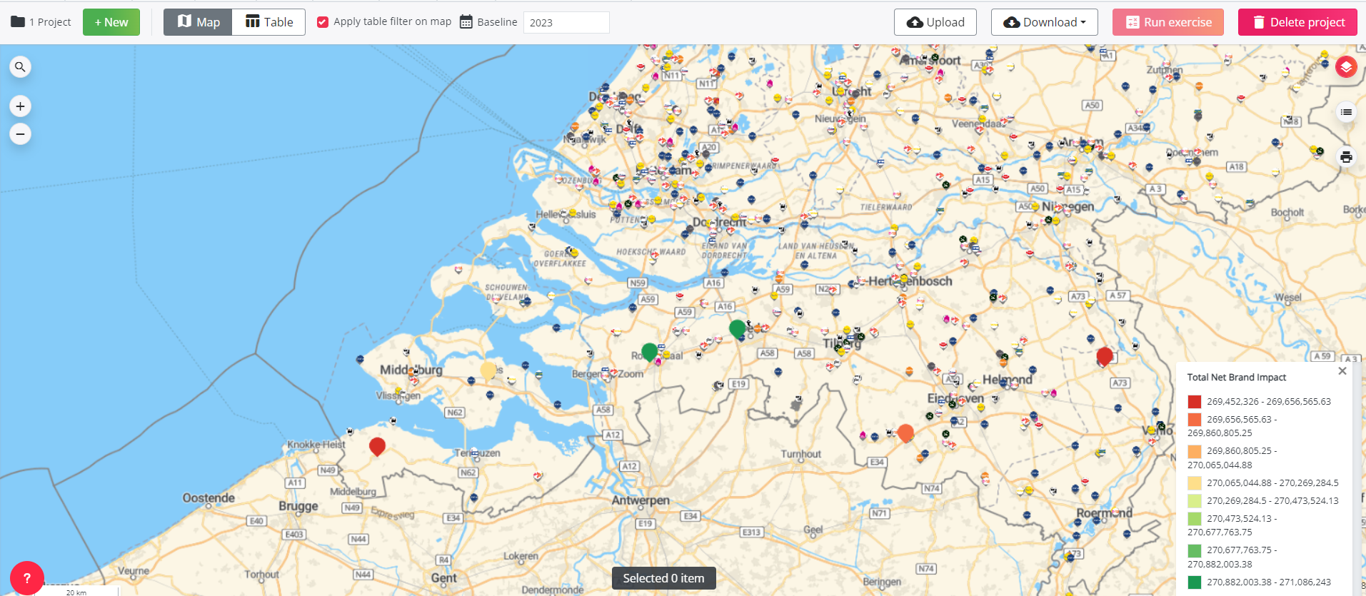
On the Map
Make sure the map legend is displayed to interpret the net brand impact of the tested locations in your project.
Each tested location is shown on the map using a color scale from red to green. This color scale represents the net impact of the tested location on the overall network and helps you visually compare the sites included in the exercise.
Locations shown in red have the lowest net brand impact compared to the other tested locations, while locations shown in green have the highest net brand impact.
For optimal reduction projects, green locations have the least negative brand impact compared to the other tested locations.
For optimal location characteristics projects, the map shows each location where one or more characteristics were modified. The red-to-green color scale helps you assess which characteristic changes are expected to create the strongest positive impact.
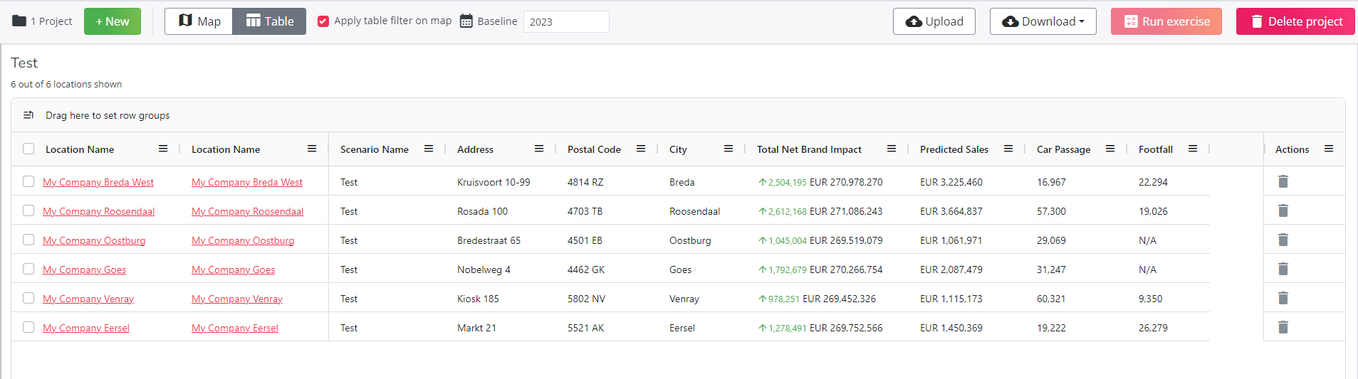
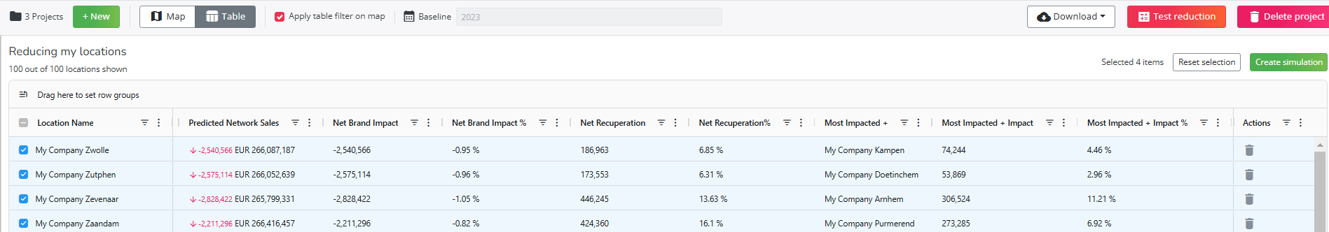
In the Table
The summary table provides the detailed results calculated by the platform model. The available indicators depend on the type of project.
- For hotspot exercises, the table includes indicators such as: predicted sales, total net brand impact, car passage & footfall around the location.
- For optimal reduction projects, the table includes indicators such as: predicted network sales, the impact on the brand (net and relative), the recuperation (net and relative), the name of the location most affected and its impact on that location, etc.
- For optimal location characteristics projects, the table includes indicators such as: predicted sales, total net brand impact, car passage & footfall around the location. In addition, the Location name column shows which characteristic was modified and which specific change was made.
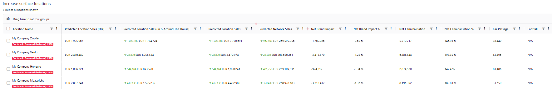
This allows you to compare the expected impact of different location characteristic changes in a structured way.