Displaying data on the map (using map layers)
The interactive map can be used both in the Marketing Efforts and the Location Planning modules of the platform. You have the possibility to display all uploaded data for your platform on the map.
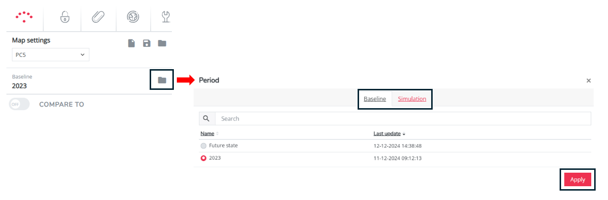
Step 1: Always start by choosing the right baseline period or simulation for which you want to display the data: Click left on the folder icon next to baseline, select baseline or simulation, select the preferred period and select apply.
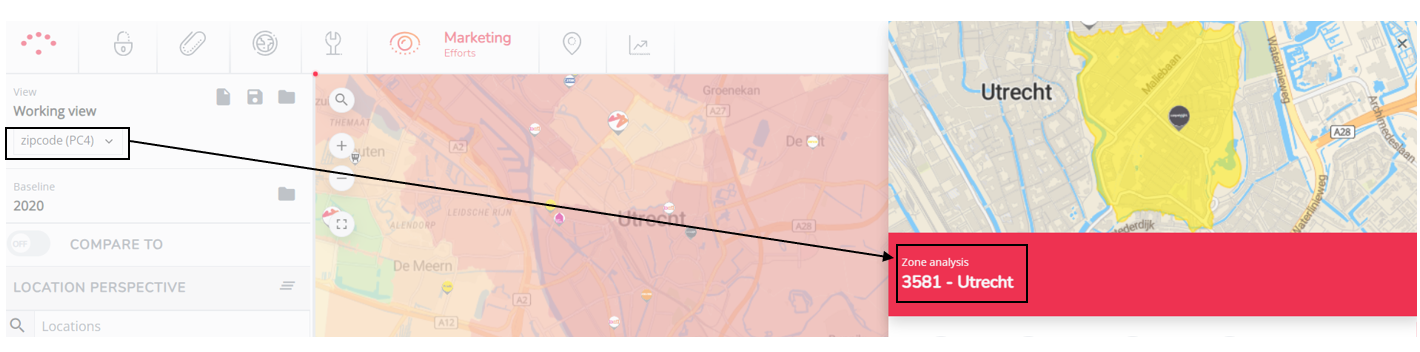
Step 2: Next make sure you have applied your preferred geographical zone level for displaying the data on the map. Choose between the configured detailed or the aggregation level(s) for your platform in the textbox left.
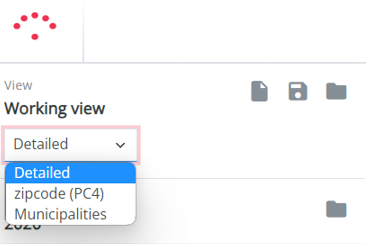
You can easily verify this by hovering over a zone on the map; the black contouring displays the size of the zone. Switching zone levels will thus make zones larger or smaller. You can also click on the zone on the map; a zone pop-up will open with a matching zone code to the chosen zone level.
Step 3: Next click on the map layer button 
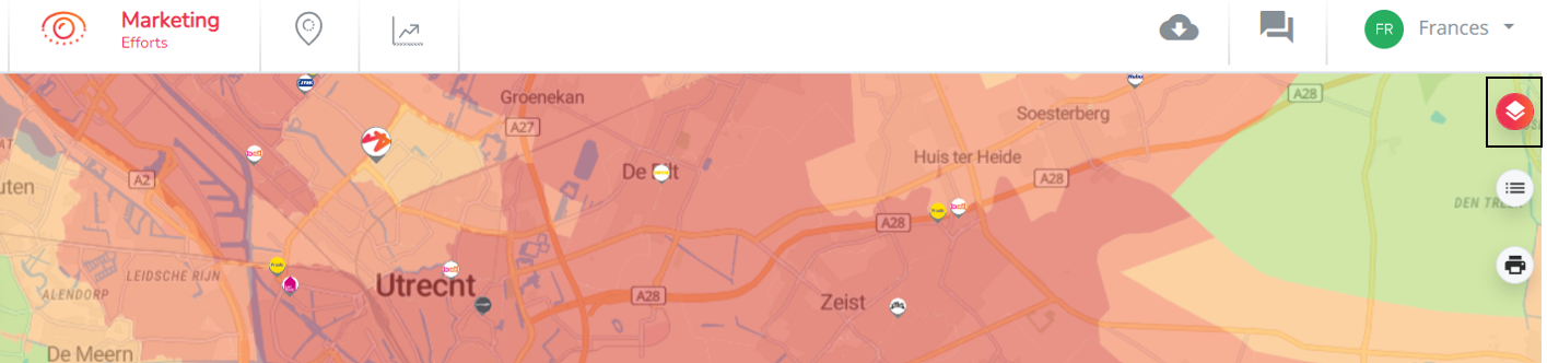
A pop-up will appear containing all the uploaded data, translated in different KPIs, that can be displayed on the map.
Step 4: Activate any of the given map layers by selecting the square (more at once possible) or round (only one at the time possible) checkbox. Deactivate them to hide it from the map. Hereby a little bit more information about the different map layer groups. For a definition of the map layer: hover with the cursor over the name and wait until the definition appears.
Locations (standard)
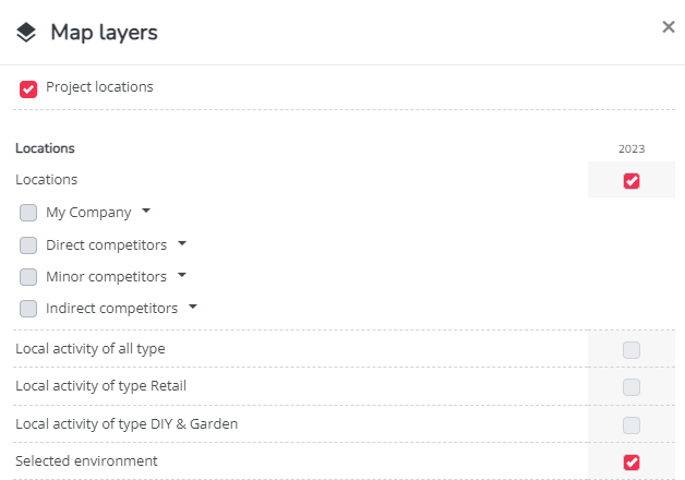
- Location filter: activated by default.
- Visualizes the locations (or brands) for the given period that are selected in the Location filter. When this KPI is not selected, the marker(s) of the locations in the location filter will not be visible.
- Locations: activated by default.
- Visualizes the logos for the different brand groups. By default are all own locations and all competitor brands for the given period visible on the map.
- Local activity of type...: NOT activated by default.
- Visualizes all local activity according to the selected type for the given period on the map. Since this layer can contain many extra locations on the map, this is not selected by default.
- Selected environment: activated by default.
- Visualizes a red line around the selection of zones in case a zone filter is applied. If this is not activated the line will not be visible.
Traffic and passage layers (standard)
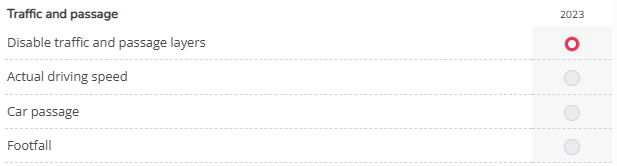
- Select disable to make non of them visible (activated by default)
- Actual driving speed (available by default)
- Car passage & footfall (only if purchased)
- see also displaying the road segment passage
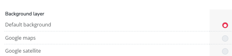
Background layers (standard)
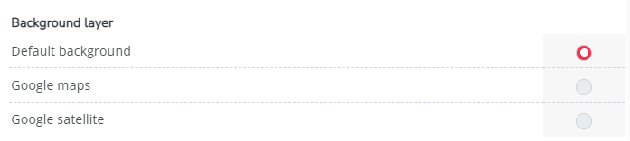
- Default background (RS default background map)
- Google maps (only if configured)
- Satellite (only if configured)
Zones (standard)
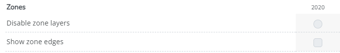
- Disable all zone layers: select this if you don't want to have any of the other categories (see below) map layers visualized. This will keep your map white (no zone map layers activated)
- Show zone edges: shows the contouring of all zones corresponding to the applied zone level.
Other categories (custom)
The other map layers are always grouped by KPI categories such as Sales KPIs, Potential KPIs etc. and can differ depending on the configuration of the platform.
Most of these configured layers can only be selected and thus visualized per 1, indicated by a button (
Next to sales KPIs, it is also possible to visualize market potential and socio demographics KPIs such as inhabitants, wealth index, educational level etc.
Step 5: Consult the legend ( 
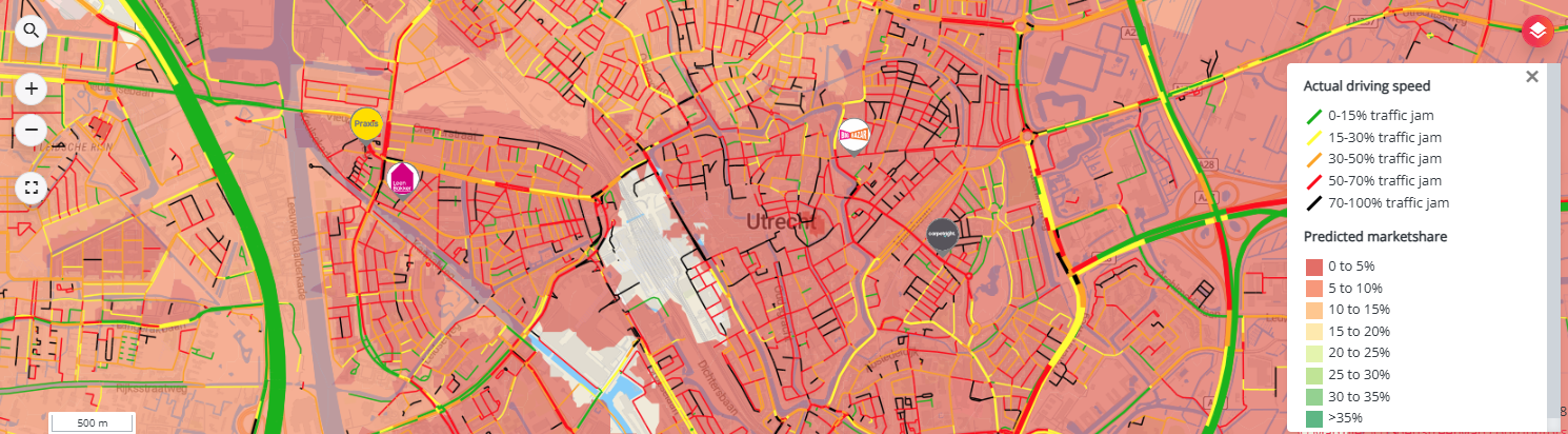
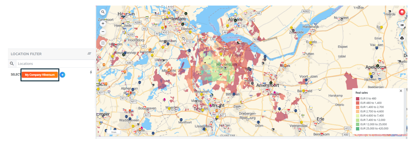
Remark! The map layer visualized can be impacted by the applied location, segment and zone filter(s). This depends whether the filter involves a location or zone characteristic (e.g. if you filter on one location only (screenshot 2) vs. the entire network (screenshot 1) and you are displaying the real market share you will now see the catchment area of this one location only vs. the real sales of the entire network.
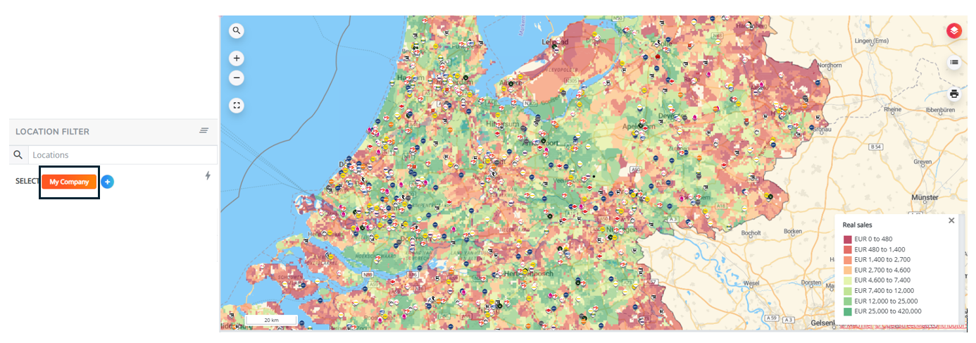
vs.